Too Big Data: Coping with Overplotting
Join the DZone community and get the full member experience.
Join For Free
written by tim brock.
scatter plots are a wonderful way of showing ( apparent ) relationships in bivariate data. patterns and clusters that you wouldn't see in a huge block of data in a table can become instantly visible on a page or screen. with all the hype around big data in recent years it's easy to assume that having more data is always an advantage. but as we add more and more data points to a scatter plot we can start to lose these patterns and clusters. this problem, a result of overplotting, is demonstrated in the animation below.
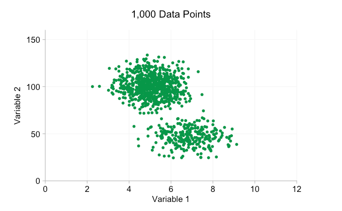
the data in the animation above is randomly generated from a pair of simple bivariate distributions. the distinction between the two distributions becomes less and less clear as we add more and more data. so what can we do about overplotting?
one simple option is to make the data points smaller. (note this is a poor "solution" if many data points share exactly the same values.) we can also make them semi-transparent. and we can combine these two options:
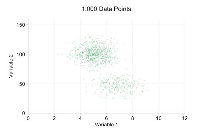
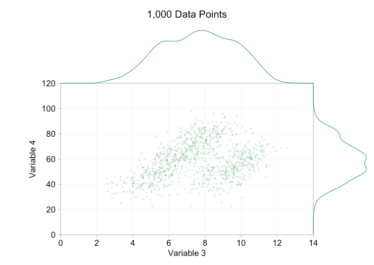
these refinements certainly help when we have ten thousand data points. however, by the time we've reached a million points the two distributions have seemingly merged in to one again. making points smaller and more transparent might help things; nevertheless, at some point we may have to consider a change of visualization. we'll get on to that later. but first let's try to supplement our visualization with some extra information. specifically let's visualize the marginal distributions . we have several options. there's far too much data for a rug plot , but we can bin the data and show histograms . or we can use a smoother option - a kernel density plot . finally, we could use the empirical cumulative distribution . this last option avoids any binning or smoothing but the results are probably less intuitive. i'll go with the kernel density option here, but you might prefer a histogram. the animated gif below is the same as the gif above but with the smoothed marginal distributions added. i've left scales off to avoid clutter and because we're only really interested in rough judgements of relative height.
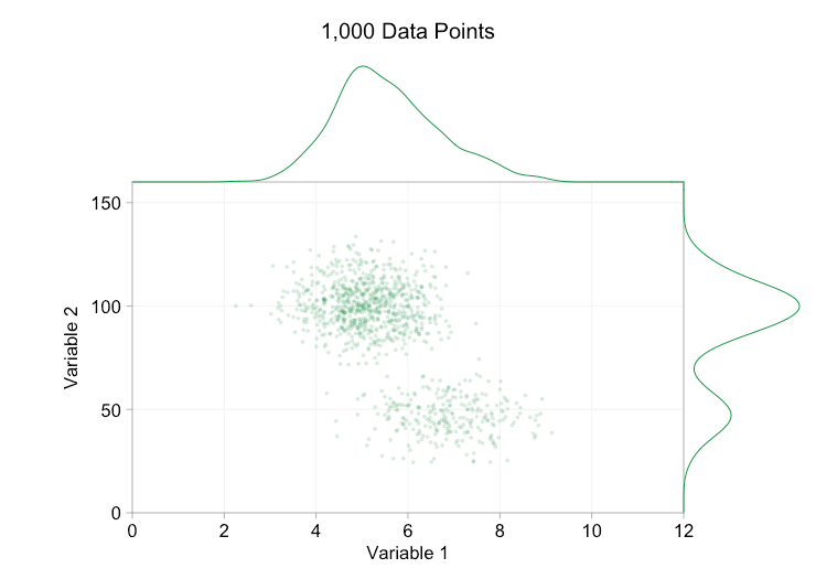
adding marginal distributions, particularly the distribution of variable 2, helps clarify that two different distributions are present in the bivariate data. the twin-peaked nature of variable 2 is evident whether there are a thousand data points or a million. the relative sizes of the two components is also clear. by contrast, the marginal distribution of variable 1 only has a single peak, despite coming from two distinct distributions. this should make it clear that adding marginal distributions is by no means a universal solution to overplotting in scatter plots. to reinforce this point, the animation below shows a completely different set of (generated) data points in a scatter plot with marginal distributions. the data again comes from a random sample of two different 2d distributions, but both marginal distributions of the complete dataset fail to highlight this separation. as previously, when the number of data points is large the distinction between the two clusters can't be seen from the scatter plot either.
returning to point size and opacity, what do we get if we make the data points very small and almost completely transparent?
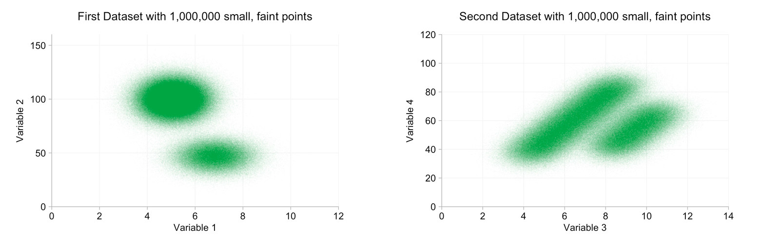
we can now clearly distinguish two clusters in each dataset. it's difficult to make out any fine detail though.
since we've lost that fine detail anyway, it seems apt to question whether we really want to draw a million data points. it can be tediously slow and impossible in certain contexts. 2d histograms are an alternative. by binning data we can reduce the number of points to plot and, if we pick an appropriate color scale, pick out some of the features that were lost in the clutter of the scatter plot. after some experimenting i picked a color scale that ran from black through green to white at the high end. note, this is (almost) the reverse of the effect created by overplotting in the scatter plots above.
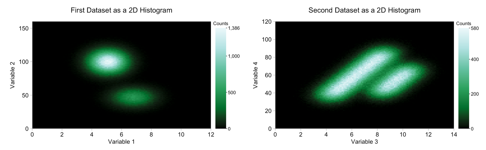
in both 2d histograms we can clearly see the two different clusters representing the two distributions from which the data is drawn. in the first case we can also see that there are more counts from the upper-left cluster than the bottom-right cluster, a detail that is lost in the scatter plot with a million data points (but more obvious from the marginal distributions). conversely, in the case of the second dataset we can see that the "heights" of the two clusters are roughly comparable.
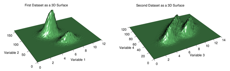
3d charts are overused, but here (see below) i think they actually work quite well in terms of providing a broad picture of where the data is and isn't concentrated. feature occlusion is a problem with 3d charts so if you're going to go down this route when exploring your own data i highly recommend using software that allows for user interaction through rotation and zooming.
in summary, scatter plots are a simple and often effective way of visualizing bivariate data. if, however, your chart suffers from overplotting, try reducing point size and opacity. failing that, a 2d histogram or even a 3d surface plot may be helpful. in the latter case be wary of occlusion.
Opinions expressed by DZone contributors are their own.
Comments